Lehi Library UX Case Study
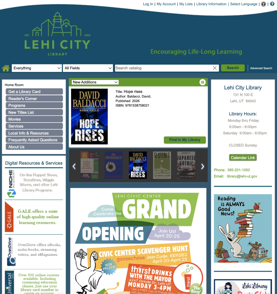
The existing website is “messy,” lacking a clear visual hierarchy, which makes finding information about new rooms, event registrations, and borrowing policies a frustrating experience. This digital disconnect threatens to overshadow the excitement of the new physical location and prevents residents from fully engaging with the community resources available to them.
Recently, Lehi city has built an entirely new civic center holding their library. As we now have this amazing new building, I feel like the library’s own website is a bit outdated. In this study I create a new concept website for the residents of Lehi, something that would reflect the same feeling of brand new and excitement to engage more people with the library.
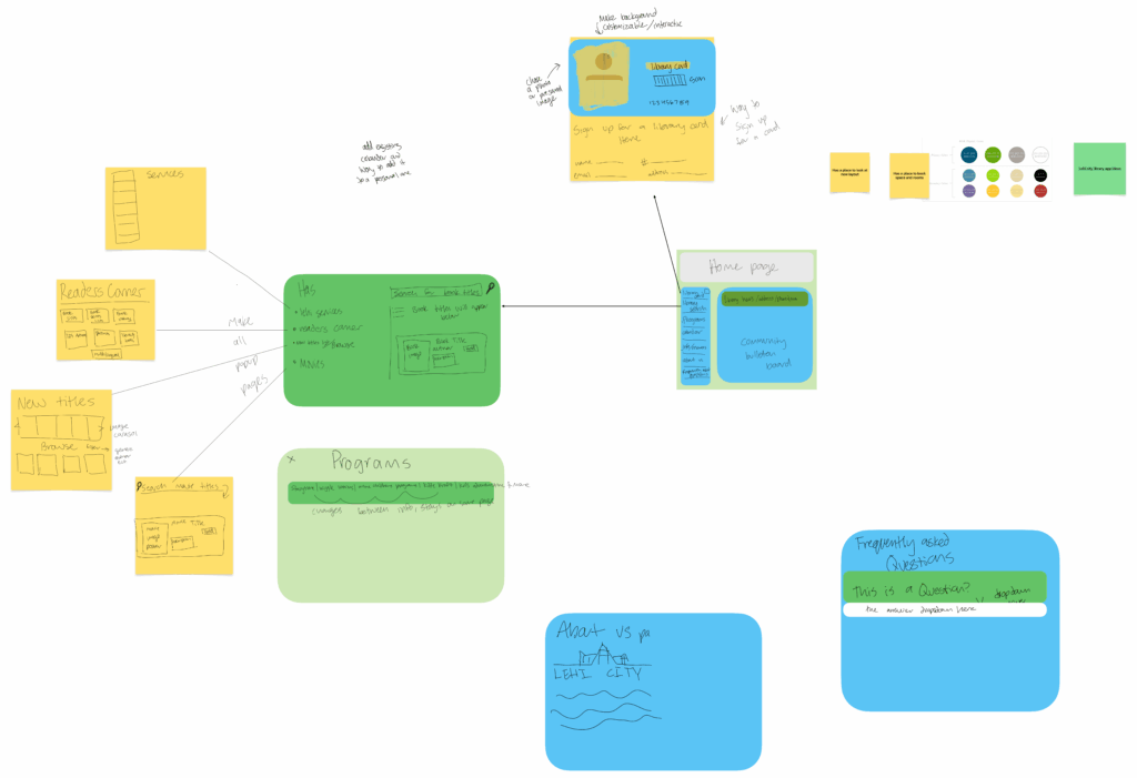
I started this project by creating a rough wire frame that would pair down the number of pages within the website significantly. I tried to keep the highly used pages the top of my priority, and creating subpages within them.
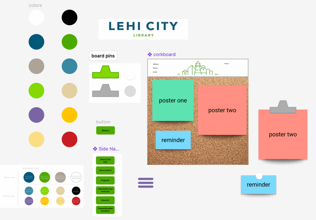
I then experimented with creating visual elements that would fit the city’s design guide of colors. I created buttons and pins that I would then use for the home page
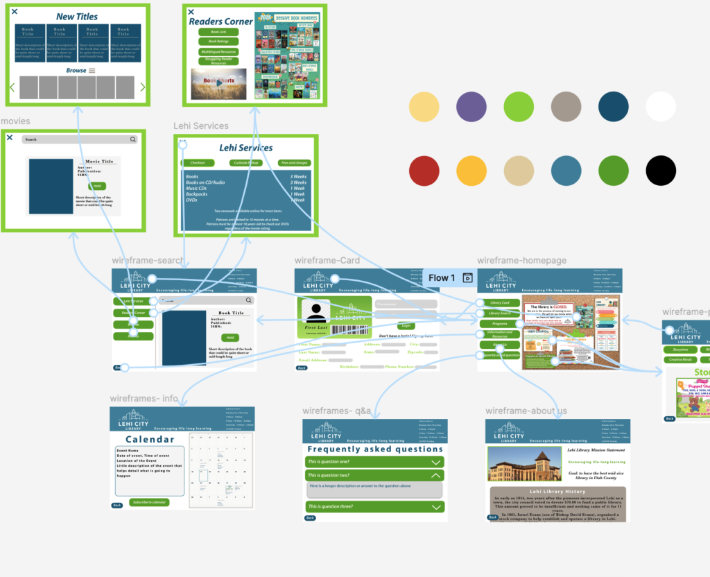
With the wire framing complete, I just needed to add all the final visual elements that would go into the website. This project helped me learn the process of creating a UX website, as well as practice the in and outs of Figma design.